


↑ 109% | ↑ 35% | ↑ 112% |
|---|---|---|
Higher session time vs. e-commerce | Increase in AOV vs. e-commerce | Increase in checkouts |
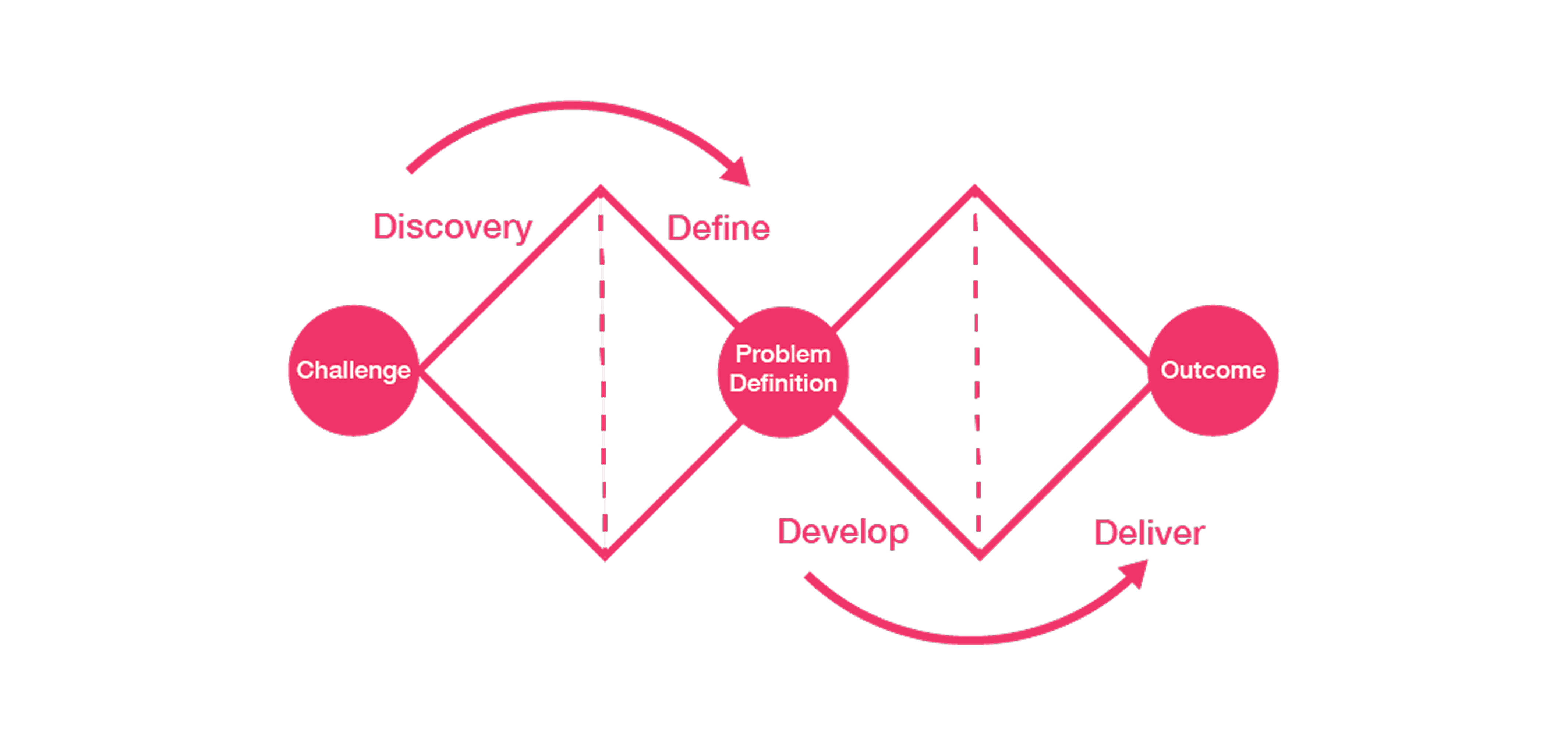
Viewer: A Portal of Polished Presence
Viewer began as a static, product-focused platform—but through a full visual and functional redesign, it evolved into an immersive 3D social experience. Outdated flat gray UI elements were reimagined with sleek glassmorphism, allowing interface components to feel light, modern, and deeply integrated into the 3D environment.
And the UI is adaptable, so we decided to add in liquid glass to our next set of UI.

I introduced social features that let users explore spaces together, interact, and shop in real-time. Brands can now customize their environments or let the default glass UI adapt visually—absorbing colors and light from the 3D world to create a seamless, on-brand experience with minimal effort.
The result? A platform that’s not just visually elevated, but socially engaging and flexible for brand storytelling in immersive digital worlds. *Note this was the first redesign with background blur, we changed to liquid glass for a sleeker look.

INTRO
Reimagining digital spaces for immersive brand experiences.
Viewer started as a flat 2D web space with gray UI and awkward hotspots — lacking both personality and flexibility. As more brands began exploring immersive commerce, our team saw an opportunity: transform Viewer into a sleek, glassmorphic 3D platform that feels custom, dynamic, and social.
Context & Chaos: Viewer’s Origins
Viewer is a web-based immersive experience where users can explore branded 3D environments, interact with products, and shop socially — all while UI elements adapt seamlessly to the space's look and feel. With a 7-week timeline and a lean team (1 designer – me 👋, 3 devs, 1 PM), we redesigned Viewer to better serve both users and brands
Also—here’s a look at my design process and how I collaborated across disciplines to bring it all to life 👇

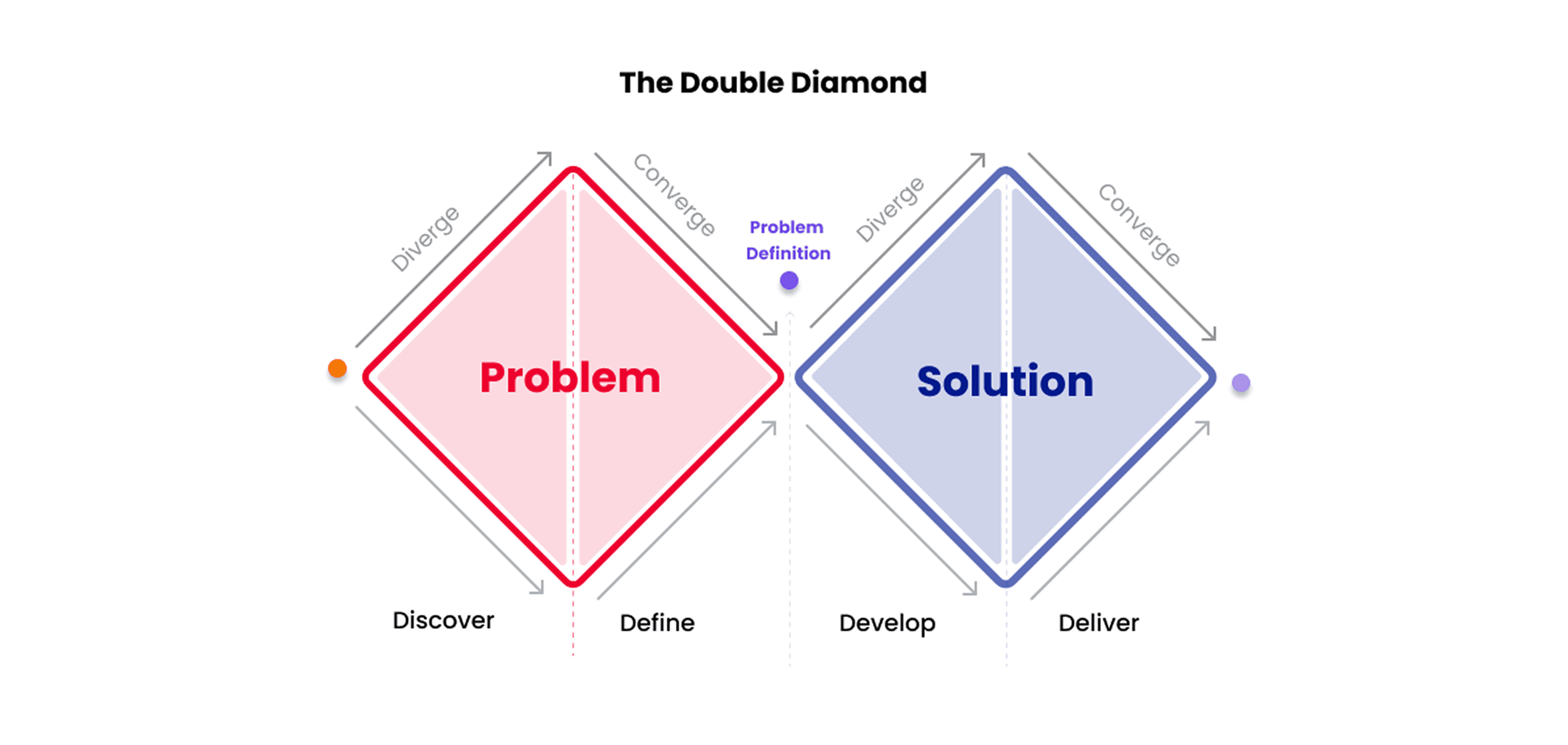
💎 I also incorporated the double diamond framework to maximize my solution. I explain more in my research phase below ⬇️.
Viewer: The “Before” Photo
The old Viewer worked—but barely passed the vibe check. It was all flat gray boxes, awkward static hotspots, and UI that felt slapped onto a 3D world like a sticker on a window. No social features, no real immersion—just a product showcase pretending to be a platform. Functional? Yes. Friendly, flexible & social? Not so much.
It was also locked in landscape mode, which didn’t reflect how people actually shop. With over 65% of e-commerce traffic now coming from mobile devices, and most users browsing in portrait mode, we knew we had to pivot. So we reimagined Viewer to be responsive—flippable between landscape and portrait—to meet users where they are: on their phones, scrolling and shopping on the go.

GOAL
How might I turn “meh” into “wow” — without breaking the timeline or the devs?
Viewer had the bones of a shopping experience, but the visuals were outdated, the interactions clunky, and the brand integration minimal. We aimed to:
Modernize the interface with a glassmorphic design system
Enable branding flexibility for different clients
Introduce social features to increase engagement
Maintain development feasibility with a tight timeline and existing codebase
RESEARCH & ANALYSIS
💎 Design Strategy: The Double Diamond Framework
To guide the redesign of Viewer, I used the Double Diamond Framework — expanding wide to explore all possible pain points and creative opportunities before narrowing down into focused, validated design solutions.
This approach helped transform Viewer from a visually beautiful but inconsistent 3D browsing experience into a cohesive, immersive environment that blended function, emotion, and system scalability.
🧭 1. Discover — Going Wide
“Before jumping into redesigning, I wanted to understand everything that Viewer could be — not just what it was.”
In this first diamond, I went wide — studying, testing, and absorbing as much context as possible to reveal what wasn’t working and what could be reimagined.
What I did:
Audited the existing product: Reviewed the 3D navigation, hotspots, UI layers, and how the visual system behaved across different world states (flat → glass → immersive).
Gathered cross-team feedback: Interviewed stakeholders from Viewer, Console, and Studio Editor to understand overlapping UX issues and visual inconsistencies across the iR ecosystem.
User testing & feedback analysis: Observed where users struggled to identify hotspots, navigate environments, and understand interaction depth.
Competitive and cross-industry research: Studied 3D e-commerce interfaces (IKEA Place, Spatial, and Unreal experiences) and games (Hello Kitty Island Adventure, Ups, iOS apps) to uncover new paradigms for mixed-reality & gaming shopification.
Explored visual languages: Researched UI systems like glassmorphism, liquid glass, and hybrid depth design to define a new look that communicated clarity and immersion.
🧠 Insight Example:
Users were drawn to the visual richness of Viewer, but the UI hierarchy was unclear. The 3D environment was visually dominant but functionally passive — leading to cognitive overload and visual fatigue.
So, rather than simply “restyling” the app, I reframed the goal:
How might we make the 3D environment feel alive, intuitive, and responsive — without overwhelming the user?
Moodboards, Memes & Mild Panic
🧠 FigJam Moodboard Chaos
I kicked things off with a FigJam full of moodboards, immersive UI inspo, and yes — Hello Kitty Island Adventure made the cut.

🤖 AI Said What?
Had some very deep conversations with AI tools about industry trends and competitive features. Apparently, even machines know Spatial.io is slaying.
🔄 User Flows, but Make It Functional
Sketched flow after flow to figure out how to gently guide users from “ooo shiny” to “add to cart” without losing them in the void.
💬 Slack Syncs & Scope Checks
Constantly checked in with devs and PM to make sure I wasn’t designing a dream world that would take 14 sprints to build.
During syncs, devs noted that stacking multiple background blurs could significantly impact load times. However, after testing, I confirmed that a single background blur layered over the virtual world performs fine. Even configurations with blur > layer > blur were within acceptable performance thresholds.
Reality check = love language 💌
🧱 Product Ecosystem Overview
I worked across a multi-tool platform that powers Infinite Reality’s 3D spatial experiences. This ecosystem includes:
Wizard Setup: A quick-start onboarding flow for business users to generate their 3D storefronts.
Studio (Editor): A powerful customization tool where users edit, rearrange, and brand their virtual spaces.
Viewer: The live, user-facing space where people interact with the final 3D world.
✅ My role involved unifying the UX across these tools—ensuring consistency, intuitive handoffs between tools, and scalable design systems that support light/dark mode, AI personalization, and branded UI integration. Read more about the architecture 🔗 here.
DESIGN
If your brand can’t slay, why display? 😤✨
Viewer wasn’t just a one-off experience — we designed it as a flexible 3D world template where brands could plug in with minimal lift and still feel fully custom. The UI was intentionally lightweight, glassy, and semi-transparent so the environment could do the talking and the brand’s aesthetic could bleed through seamlessly.
ReDESIGN
📲 Landscape to Responsive
I shifted to portrait-first (but responsive) design to match how people actually shop—on their phones, in portrait mode, 65% of the time.
Redesign into →

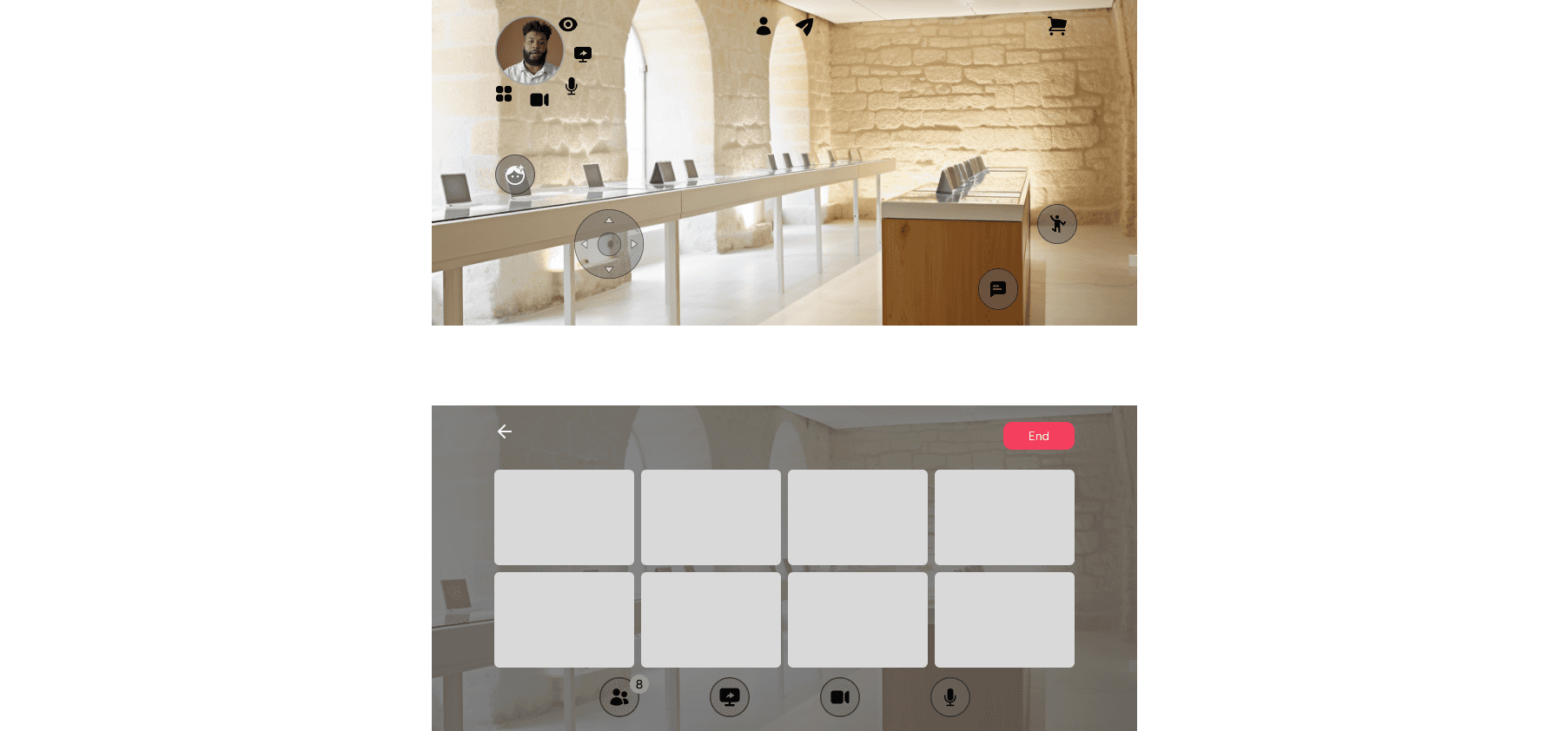
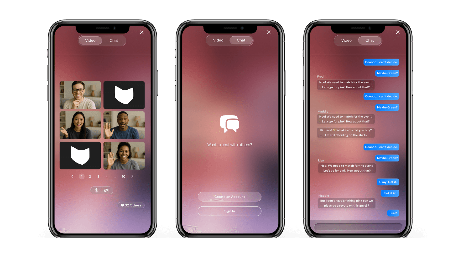
👑 No more side quests: Social, Simplified
I streamlined social features into a single toggleable full-screen view—merging chat and video, removing screen sharing on mobile—to simplify the experience, reduce load times, and make it feel more social, not siloed.
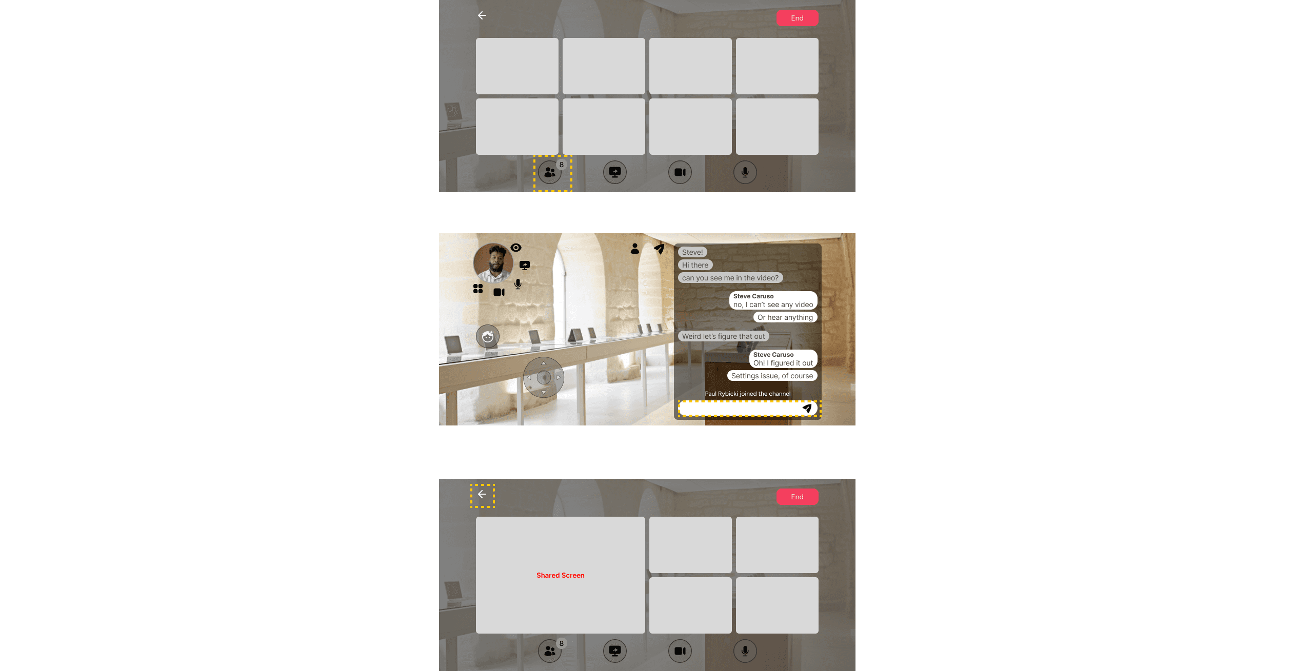
Redesign into →
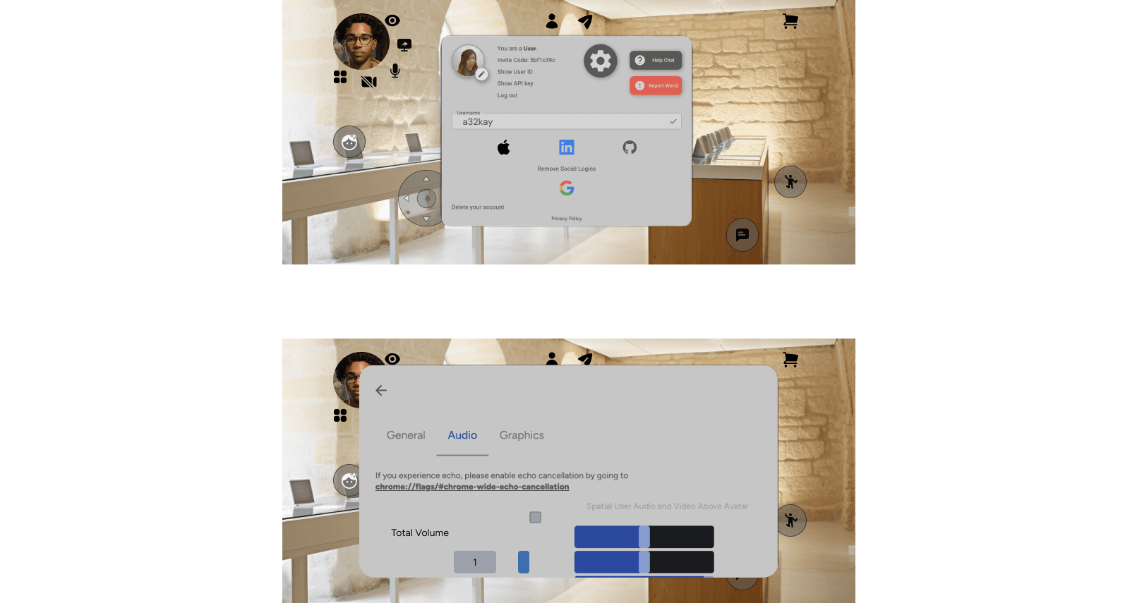
⚙️ Settings: From Stacked Chaos to Seamless Control
I also redesigned the mobile settings experience. Originally built with clunky modals that stacked awkwardly on small screens, the flow felt cramped and disjointed. So we scrapped the modal mess and took inspiration from familiar patterns used by Google and Apple—think native-style settings screens with clear sections, simple toggles, and smooth transitions. The result? A more intuitive, scrollable layout that feels right at home on mobile and scales beautifully with more features.
Redesign into →
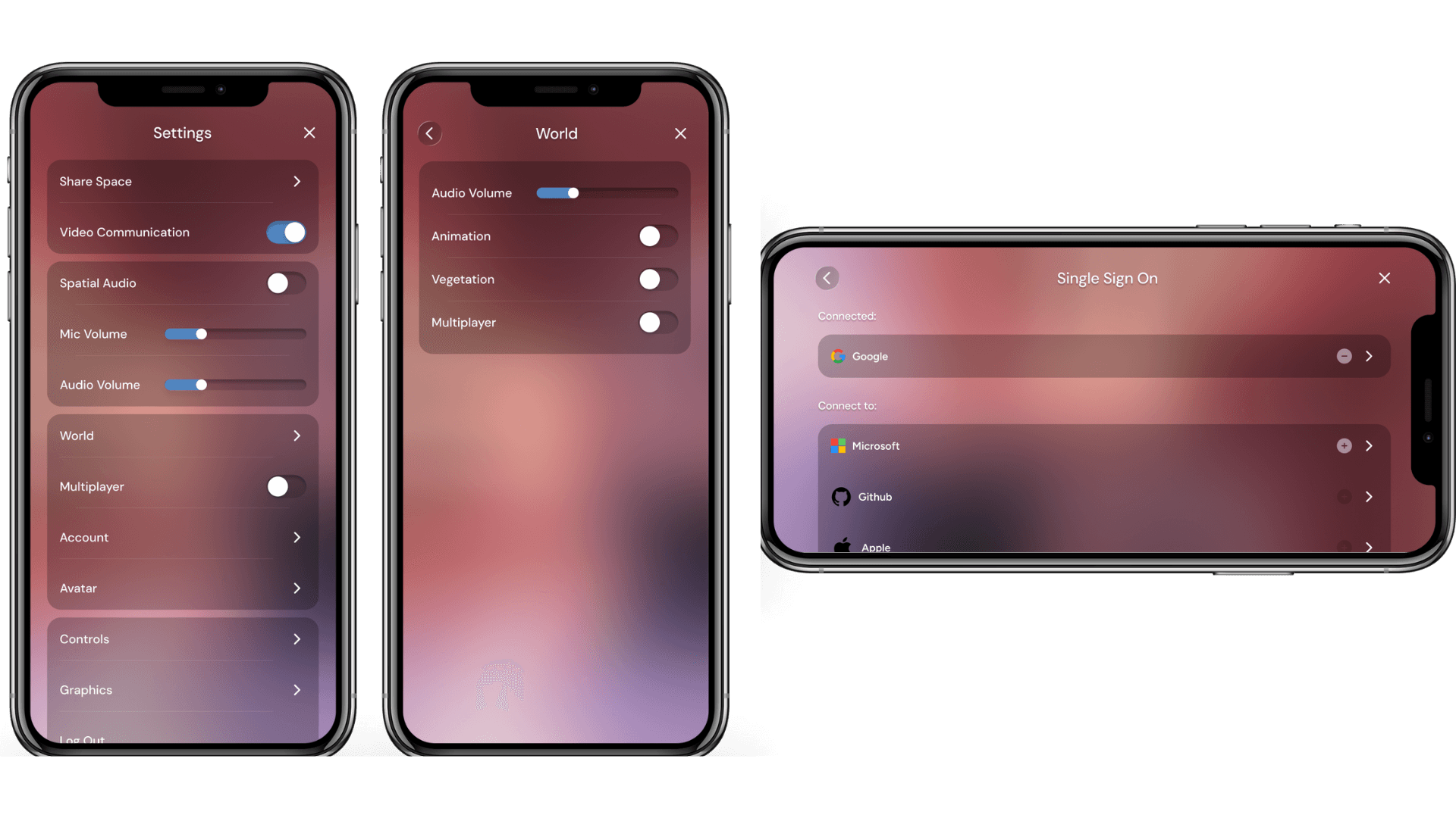
User testing showed us which settings were most frequently used, so I surfaced key toggles right upfront for quick access—even if they also appear deeper in their respective categories. Yes, there’s some intentional repetition—but it’s by design. The goal was to reduce friction and improve task flow, especially for users who just want to tap, toggle, and get back to exploring.
For visual design, since layering background blur on top of another blur wasn’t technically feasible, we opted for a subtle black opacity underneath. It’s not fully opaque, but just enough to make white text, buttons, and brand elements pop—while still letting the 3D world peek through.
💻 Desktop Deserves Nice Things Too
No, I did not forget about hover states in desktop.

🥴 “Handling Complexity”
This ecosystem required managing:
Handoff logic between tools
UI state across different user types (novice to advanced)
Responsive behavior (landscape ↔ portrait)
Design scalability to support Shopify/non-Shopify users
Performance-conscious glassmorphism UI across the platform
🧱 Built with Autolayout (because we scale responsibly)
Every component was built with structure and flexibility in mind — no dragging rectangles here.
🔣 Component Variables for Instant Rebrands
Dark mode? Pastel theme? Cyberpunk collab? One swap and done. Brands could change colors, typography, and assets without touching the layout.
🗂 Design System-Ready
Everything was snapped into our shared design system so it could be reused across products, client demos, and future Viewer expansions.
🤖 AI Prototypes + Dev Collabs
Tested interaction logic with Cursor + Builder.io and synced constantly with devs through Storybook + Slack huddles. Built fast, broke nothing.
🥽 Virtual Reality Flow
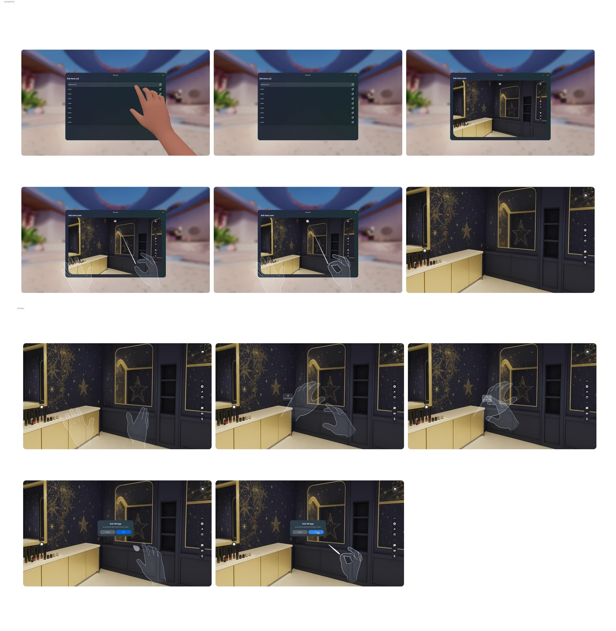
I designed Viewer to blend intuitive interaction with elegant visuals, creating a calm, emotionally engaging 3D shopping experience. Built with Meta Quest in mind, it allows users to step inside a virtual store and explore products and people in an immersive, seamless environment.
PROTOTYPING
Mock It Till You Rock It.
Lo-fi wireframes? Ugly but effective.
Hi-fi mockups? Sexy and scrollable. *See down below
Interactive demos? The moment.
I even tested with fake brands (sorry, “inspired by real ones”) to make sure the UI worked across industries — whether you're selling sneakers, songs, or swords.
IMPACT
From clunky to glassy.
🚀 Viewer evolved into a polished, immersive 3D shopping space with flexible UI, social features, and actual client demo readiness.
💬 Stakeholders = obsessed. Devs = not burned out. Me = proud.
📈 It’s now built to scale — across brands, content types, and future features.
Next Steps:
Real user testing with clients
More accessibility support
Expanding the system across other immersive tools (and yes, maybe mobile)


